Physical Address
304 North Cardinal St.
Dorchester Center, MA 02124
Physical Address
304 North Cardinal St.
Dorchester Center, MA 02124
Discover 24 stunning kitchen color ideas to transform your cooking space! From timeless whites to bold jewel tones, find the perfect palette to create your dream kitchen.
Is your kitchen feeling a little…blah? Perhaps it’s lost its spark, or maybe it just doesn’t reflect your current style. The good news is, you don’t need a complete overhaul to breathe new life into your cooking space.
Often, the most impactful change comes from something as simple yet transformative as color. Choosing the right kitchen color ideas can dramatically alter the mood, spaciousness, and overall feel of your kitchen, turning it from a purely functional area into a vibrant heart of your home.
Ready to discover the power of paint and beyond? Let’s explore 24 stunning kitchen color ideas that will inspire you to revamp your space!
White kitchens continue to dominate design magazines and homeowner wish lists for good reason. Their timeless elegance acts as a neutral chameleon, effortlessly adapting to changing trends. White creates an immediate sense of spaciousness and light, making even smaller kitchens feel open and airy. This enduring appeal stems from white’s ability to act as a blank canvas, allowing you to easily refresh your kitchen’s look by swapping out accessories or hardware without major renovations.
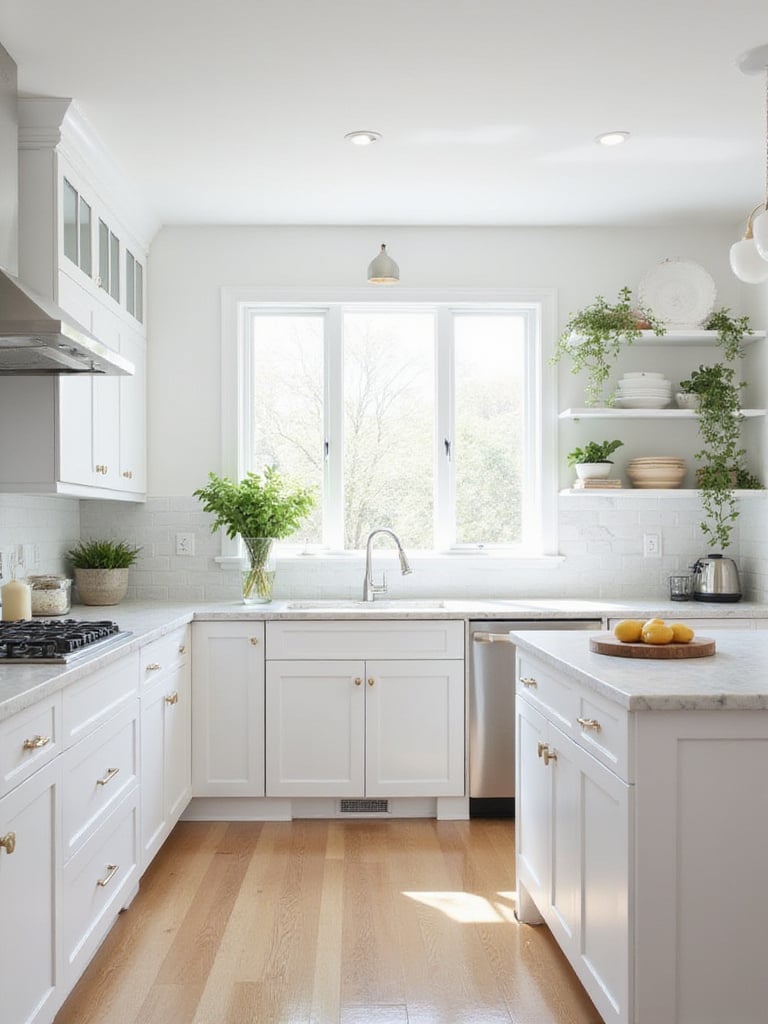
The pristine beauty of a white kitchen does require some consideration. White surfaces show dirt, stains, and scratches more readily than darker colors, necessitating more frequent cleaning. To prevent a clinical feel, strategic material selection and texture incorporation are crucial. Wood elements, textured backsplashes, and varied finishes can add warmth and dimension to an all-white palette.
“White kitchens are like the perfect little black dress of interior design—always in style and endlessly versatile.”
Here’s where it gets interesting… while white provides a clean foundation, the next color option we’ll explore adds a subtle warmth that many homeowners are gravitating toward.
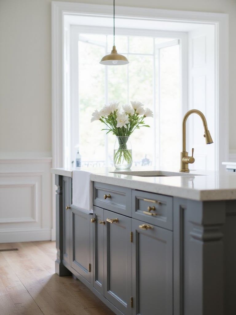
Seeking a sophisticated alternative to stark white? Warm gray tones offer that perfect blend of neutrality and subtle warmth. Unlike cooler grays which can feel detached, warm grays possess undertones of beige, cream, or even hints of brown, creating a truly inviting atmosphere. This inherent warmth makes them perfect for kitchens—spaces where you want to feel relaxed while cooking and gathering.
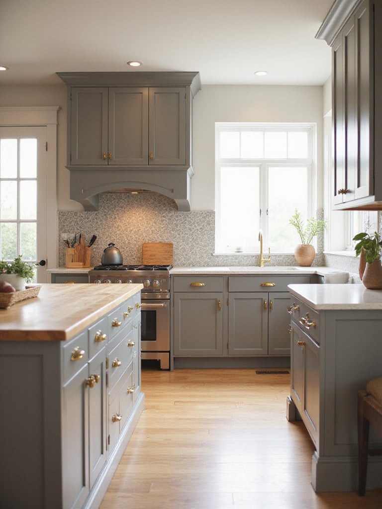
Warm grays are incredibly versatile, providing a neutral backdrop that allows other design elements to shine. Colorful appliances pop against warm gray cabinets, while natural wood accents add depth and texture. Even vibrant backsplashes become striking focal points without clashing. Popular choices include paint colors with subtle undertones of beige, tan, or even a hint of green, offering a spectrum of warmth to suit your taste.
The tricky part is finding the perfect warm gray tone for your lighting conditions. What looks perfect in the store might appear different in your kitchen’s natural light. But once you nail it, the results are stunning.
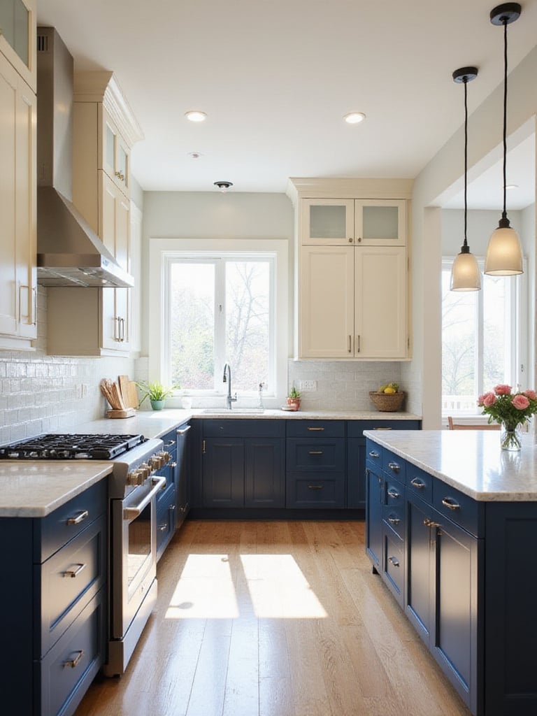
For a kitchen that exudes sophistication and timeless appeal, consider the captivating depths of navy blue. This rich hue evokes a sense of calm reminiscent of the vast ocean. Navy is surprisingly versatile, capable of being both dramatic and understated depending on how it’s styled. It cleverly hides smudges and imperfections better than lighter colors—a practical choice for busy kitchens.
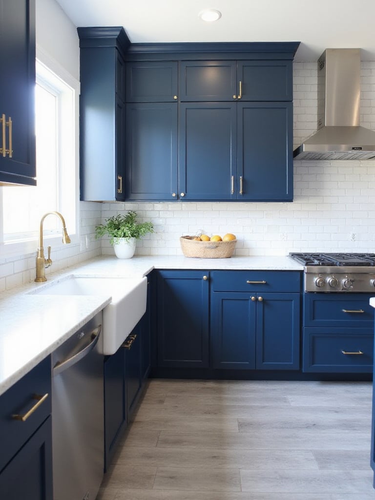
Navy blue shines across various design styles. It’s a natural fit for coastal themes but works beautifully in traditional, modern, and farmhouse kitchens too. The key lies in balance. Navy cabinets with brass hardware and crisp white countertops create a classic, elegant look. Alternatively, incorporating Reclaimed Wood accents introduces a rustic touch, grounding the formality of navy.
What many people overlook about navy kitchens is their ability to make a space feel simultaneously bold and serene. The deep blue creates a sense of depth that draws you in while maintaining a calm atmosphere—perfect for the heart of your home.
Let me show you another perspective on kitchen color ideas that brings the outdoors in with a gentle, calming presence.
Sage green has surged in popularity, and for good reason. This muted green tone instantly creates a relaxing atmosphere and connection to the outdoors. Acting almost as a neutral, sage green pairs beautifully with virtually any design style, from rustic farmhouse to sleek modern minimalist. It’s a timeless kitchen color choice that gracefully sidesteps fleeting trends, ensuring lasting style.
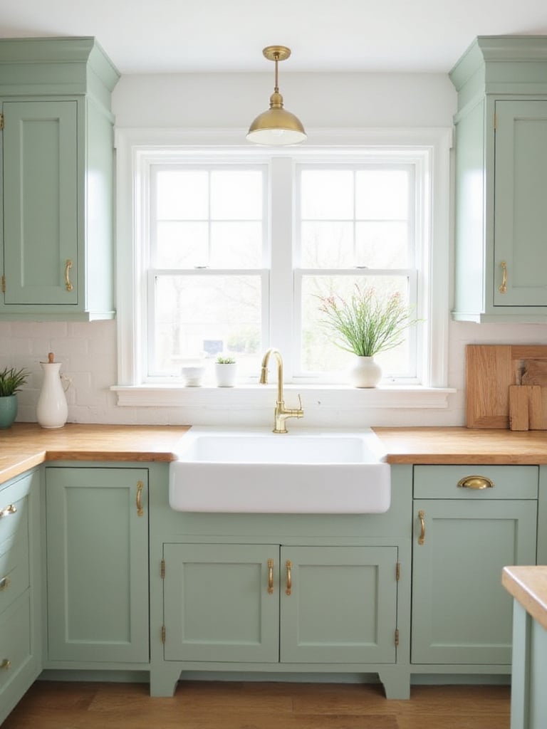
The versatility of sage green truly shines across design styles. It’s a natural partner for farmhouse kitchens, enhancing their rustic charm. It works beautifully in Scandinavian-inspired spaces, adding subtle warmth to minimalist aesthetics. Even modern kitchens benefit from sage green’s softening effect, preventing them from feeling sterile. When paired with classic hardware, sage green complements traditional styles too, adding a fresh twist to timeless designs.
The heart of the matter is that sage green creates a sense of calm that’s perfect for today’s hectic lifestyles. It transforms your kitchen into a peaceful retreat while still being practical and versatile enough to adapt as your style evolves.
If you desire a kitchen that feels like a peaceful retreat, light beige and cream tones are your allies. These soft neutrals create a soothing atmosphere, promoting a sense of well-being and reducing stress. This tranquil ambiance transforms cooking into a more enjoyable activity while creating a welcoming hub for gathering. Their inherent neutrality contributes to versatility and enduring appeal, avoiding the visual fatigue that brighter colors might induce.
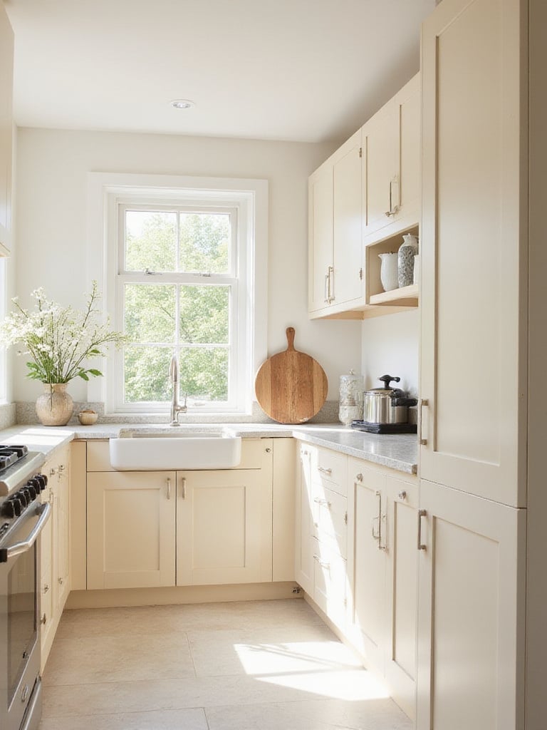
Light beige and cream adapt beautifully to diverse styles. In traditional kitchens, they pair with classic cabinetry and natural stone for timeless elegance. For farmhouse kitchens, they combine with rustic wood and vintage hardware for a welcoming feel. In Scandinavian designs, they enhance minimalism and natural light. Even coastal kitchens benefit, as these colors mimic sand tones, creating a relaxed vibe when paired with natural textures.
“Beige isn’t boring—it’s the perfect backdrop for creating a kitchen that feels both sophisticated and welcoming.”
Do you see how huge that is? A color palette that works with virtually any style while creating a sense of calm in your kitchen. But if you’re looking for something with more drama and depth, our next kitchen color idea might be just what you need.
For those seeking modern sophistication and dramatic flair, charcoal gray is exceptional. It offers a stylish alternative to stark black or plain white, bringing groundedness and depth to your kitchen. It acts as a versatile backdrop, allowing other design elements to pop. Practically speaking, charcoal gray forgives smudges and fingerprints better than lighter colors—ideal for busy kitchens.
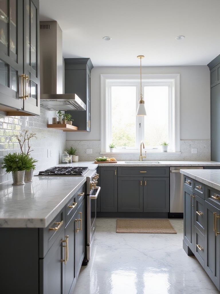
Charcoal gray’s versatility extends across design styles. It shines in modern kitchens, providing sleek, minimalist elegance. It’s perfect for industrial-style spaces, pairing seamlessly with exposed brick and metallic hardware. For a more traditional look, charcoal gray combines beautifully with classic cabinetry and rich wood tones. Even farmhouse kitchens benefit from charcoal gray on islands or lower cabinets, adding modern edge to rustic charm.
The game-changer happened as I worked with clients who were initially hesitant about dark kitchen colors. Once they saw how charcoal created depth without feeling gloomy (especially with proper lighting), they were sold on its sophisticated appeal.
Let’s brighten things up with our next kitchen color idea that brings sunshine into your cooking space.
Looking to inject happiness and warmth into your kitchen? Pale yellow accents are a delightful solution. This versatile color evokes joy, warmth, and optimism without overwhelming your space. Interestingly, yellow is psychologically associated with food and appetite, making it a natural fit for kitchens. It works beautifully with neutrals like white and gray, as well as bolder hues like blue and green.
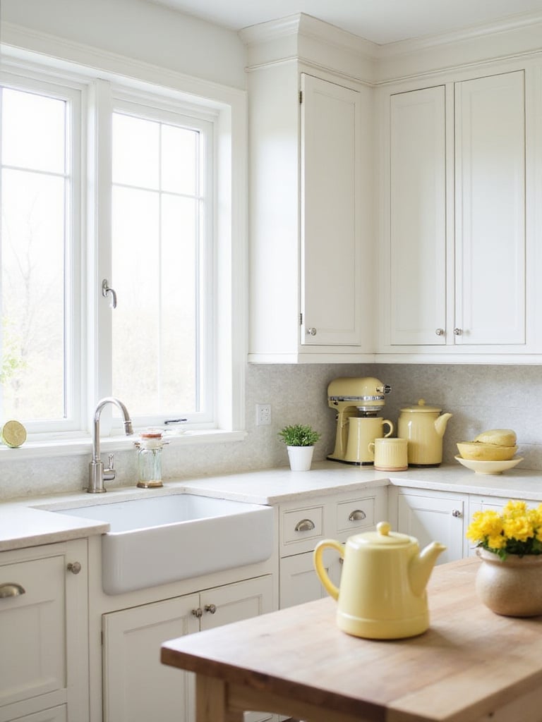
Pale yellow can be strategically incorporated through various elements. Consider using it for hardware, textiles like towels and curtains, or small appliances. Decorative accessories such as vases, bowls, or artwork in pale yellow can enhance the joyful ambiance. Even more permanent elements like backsplash tiles or Pendant Lights can add integrated touches of sunshine. The key is thoughtful placement that enhances without overwhelming.
Think of it as sunshine in your kitchen that you can control—add just enough to brighten your mood without overwhelming the space. It’s kinda like having a perfect sunny day indoors, regardless of the weather outside.
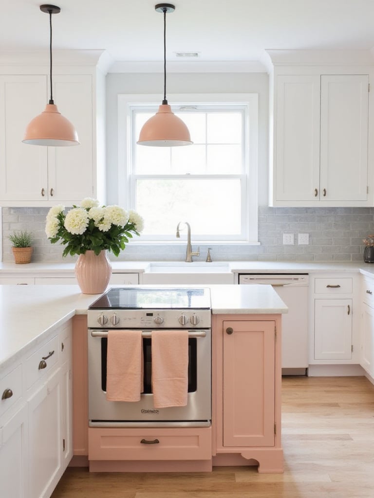
For a kitchen that whispers elegance and exudes gentle warmth, consider the subtle charm of dusty rose. This muted shade brings unique warmth and serenity to your kitchen space. Unlike brighter pinks, dusty rose isn’t overly stimulating, creating a calming environment for cooking and gathering. Its inherent softness creates a romantic atmosphere while maintaining surprising versatility across design styles.
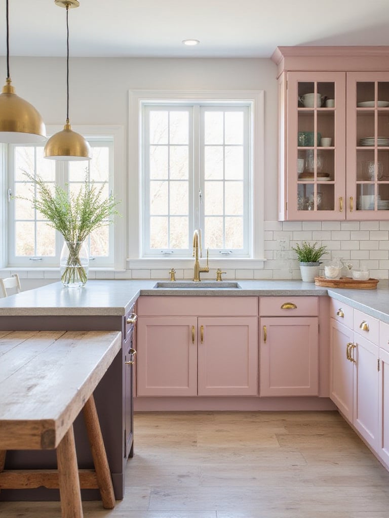
Dusty rose adapts beautifully to color pairings. It harmonizes with soft whites, creams, and light grays for subtle sophistication. For dramatic contrast, pair with deeper colors like sage green or navy blue. Metallic accents, particularly brass or gold, complement dusty rose with luxurious warmth. Natural wood tones enhance its inviting quality, adding texture and grounding the softness of pink.
The surprising part is how dusty rose can read as an almost-neutral in certain lights. It’s subtle enough to live with long-term but distinctive enough to make your kitchen memorable. This balance of unique character and livability makes it a clever choice for homeowners who want something different without going too bold.
Let’s shift from romantic softness to a color palette that embodies earthy warmth and rustic beauty.
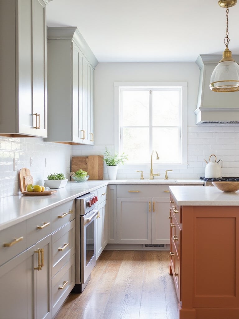
If you’re drawn to natural textures and warm atmospheres, terracotta offers a compelling choice for kitchen color ideas. Meaning “baked earth” in Italian, terracotta embodies rustic charm and natural warmth. Its earthy tones, ranging from light ochre to deep reddish-brown, create a welcoming ambiance. Beyond aesthetics, terracotta is durable and relatively low-maintenance, making it practical for various kitchen applications.
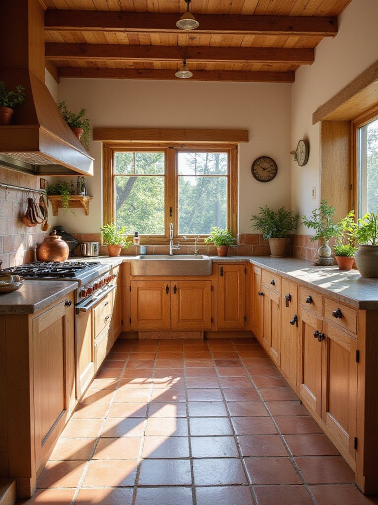
Terracotta shines when paired with other natural materials. Consider wooden cabinetry in lighter shades like natural oak or painted cream for balanced contrast. Stone countertops introduce sophistication while maintaining the natural aesthetic. Copper accents enhance the warm tones and create cohesion. Natural light plays a crucial role in showcasing terracotta’s beauty, highlighting its texture and color variations.
“Terracotta brings the warmth of Mediterranean sunshine into your kitchen, regardless of where you live. It’s like a permanent vacation for your cooking space.”
The ripple effects are enormous when you introduce terracotta into your kitchen design. Beyond just color, it brings texture, history, and an organic quality that makes your kitchen feel grounded and authentic—qualities that are increasingly valuable in our digital world.
For a kitchen design that transcends trends, the classic combination of black and white remains a perennial favorite. The stark contrast creates a clean, crisp, and undeniably sophisticated look that stays stylish year after year. Black and white act as a neutral canvas, providing the perfect backdrop for easy customization through accessories or décor changes. This simplicity promotes a sense of order and calm, contributing to a welcoming cooking space.
Achieving balance in a black and white kitchen requires careful consideration of proportions. A predominantly white kitchen with black accents creates a brighter, airier feel. Conversely, a predominantly black kitchen with white accents offers a more dramatic aesthetic. A balanced 50/50 split can be incredibly effective, with black cabinetry on the lower half and white on the upper half. Another approach uses black as a focal point, such as a striking black island against white perimeter cabinets.
Here’s what happened when I designed my first black and white kitchen: what initially seemed like a safe choice revealed itself as an incredibly versatile foundation. The client could easily update the look seasonally with colorful accessories, making it both timeless and adaptable.
For a kitchen design that breaks away from monotony, consider the dynamic versatility of Two-Tone Cabinets. This approach creates visual interest and depth, preventing a kitchen from feeling flat. It highlights architectural features like central islands or unique cabinet shapes. Two-tone cabinetry allows for personalized expression, enabling you to combine colors that reflect your style. Strategically using light and dark colors can manipulate the perception of space, making a kitchen feel larger or cozier.
The beauty of two-tone kitchens lies in endless color combinations. White and gray offer a clean, contemporary look. Navy and white provide sophisticated contrast with nautical undertones. Light wood tones combined with dark green or black create a warm, grounded aesthetic. For the adventurous, bolder choices like teal and coral, or contrasting wood stains, create truly unique spaces. The key is selecting colors that complement each other and harmonize with existing elements.
My breakthrough came when I realized two-tone cabinets weren’t just about aesthetics—they’re also practical. Using darker colors on lower cabinets (where fingerprints and scuffs are more common) and lighter shades on upper cabinets creates a kitchen that’s both beautiful and functional. This approach to kitchen color ideas balances style with real-life practicality.
Let me paint you a picture of how natural materials can transform your kitchen with warmth and beauty.
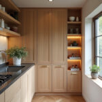
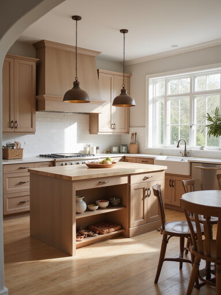
For a kitchen that feels inherently welcoming, embracing wood tones delivers unmatched warmth. Wood brings natural beauty, texture, and an inviting atmosphere that moves away from sterile aesthetics. It adds depth and visual interest, complementing styles from rustic to minimalist. The natural variations in wood grain provide unique character, ensuring no two kitchens are alike. Wood is also durable and sustainable when sourced responsibly, adding eco-conscious appeal.
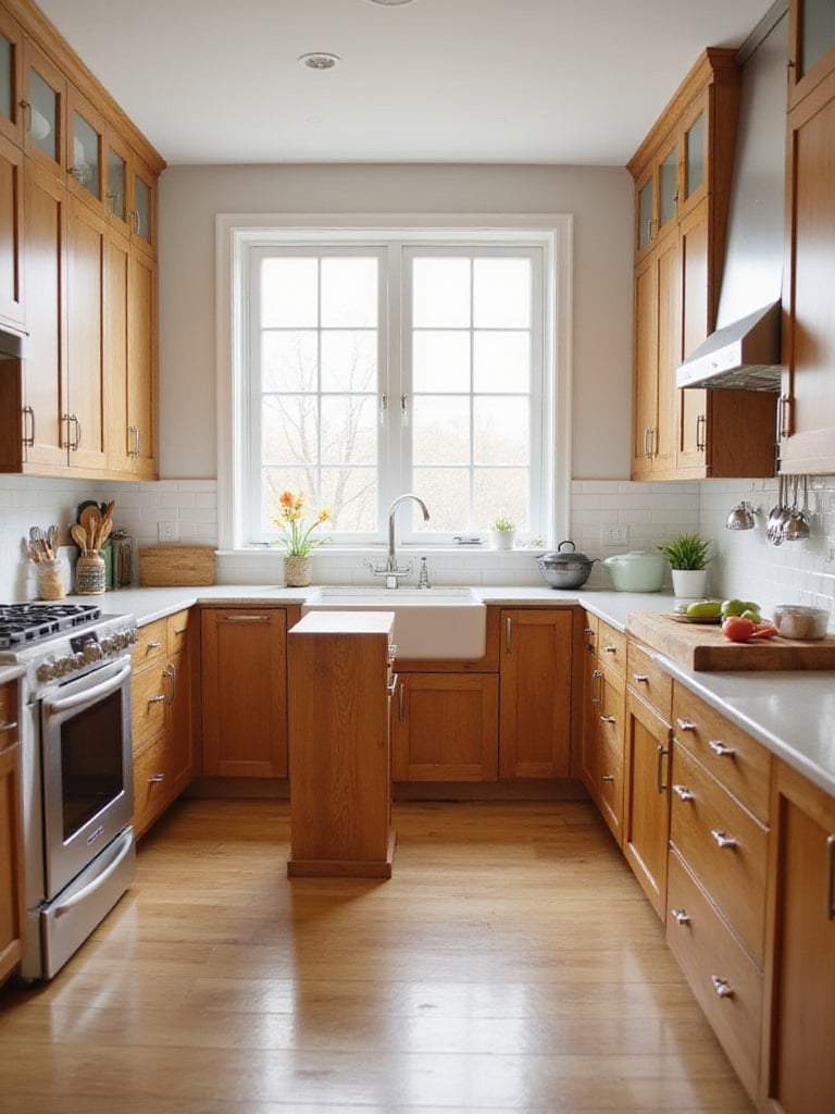
Choosing the right wood type and finish is crucial for achieving your desired aesthetic. Oak offers durability and distinctive grain patterns. Maple provides a lighter, more uniform tone that takes stain well. Cherry brings rich, warm reddish hues for sophistication. Walnut adds drama and elegance with its darker tones. Birch offers an affordable, versatile base. Finishes range from natural stains highlighting wood’s inherent beauty to painted or glazed options for broader color possibilities.
Picture it this way: wood in a kitchen is like adding a living element that brings character, history, and warmth. Each knot and grain pattern tells a story, creating a space that feels collected and authentic rather than manufactured.
For those seeking a neutral kitchen color that’s both warm and sophisticated, “greige” offers the perfect balance. This blend of gray and beige combines the best qualities of both, providing a neutral foundation with inherent warmth and depth. Greige pairs seamlessly with diverse materials, colors, and design styles, transitioning from farmhouse to contemporary minimalist. It provides a calming backdrop that allows other kitchen elements to shine, ensuring lasting appeal and design longevity.
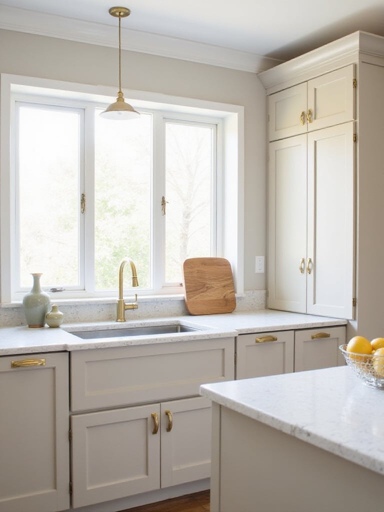
Incorporating greige into kitchen design offers numerous possibilities. It works beautifully on cabinets, providing a stylish foundation. On walls, it offers subtle warmth compared to pure gray. For a layered look, use different greige shades throughout—lighter on upper cabinets to maximize light, darker on lower cabinets to ground the design. Greige can also appear in backsplash tiles, countertops, or textiles for a cohesive palette. The key is balancing its neutrality with carefully chosen elements to prevent flatness.
What complicates this color is that it changes dramatically with lighting. A greige that looks perfect in morning light might appear completely different by evening. This chameleon-like quality is both its challenge and its charm—once you find the right shade, it creates a sophisticated backdrop that works with virtually any accent color.
For a kitchen that makes a statement, consider the captivating allure of teal. This sophisticated color blends the calming properties of blue with the invigorating energy of green. It brings depth and richness, acting as a focal point without being overly loud. Teal’s coolness beautifully balances warmer elements like wood accents or metallic hardware.
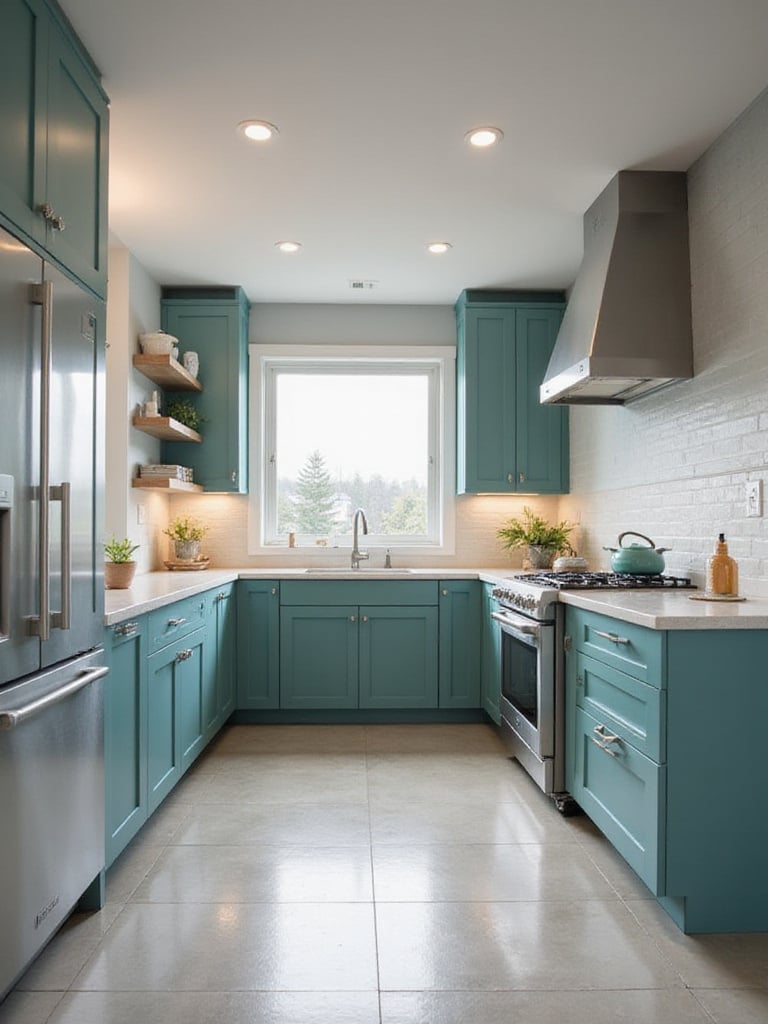
Teal’s versatility shines across design styles. It works in modern kitchens with clean lines, adding visual interest to streamlined spaces. It’s equally at home in traditional or farmhouse kitchens when paired with natural wood and vintage hardware. Teal aligns perfectly with bohemian designs, where it combines with other vibrant colors and global patterns for a personalized space.
My experience went like this: clients who were initially hesitant about bold kitchen color ideas were often surprised by how livable teal became once installed. Rather than overwhelming the space, it created a rich backdrop that made the entire kitchen feel more intentional and designed.
Looking to add vintage charm and sophisticated energy to your kitchen? Mustard yellow highlights are an excellent choice. This warm, inviting color brings vintage appeal and sophisticated style without the harshness of brighter yellows. It creates a cozy atmosphere perfect for cooking and gathering. Mustard yellow pairs well with neutrals like gray and white, as well as bolder shades like navy and forest green, offering design flexibility.
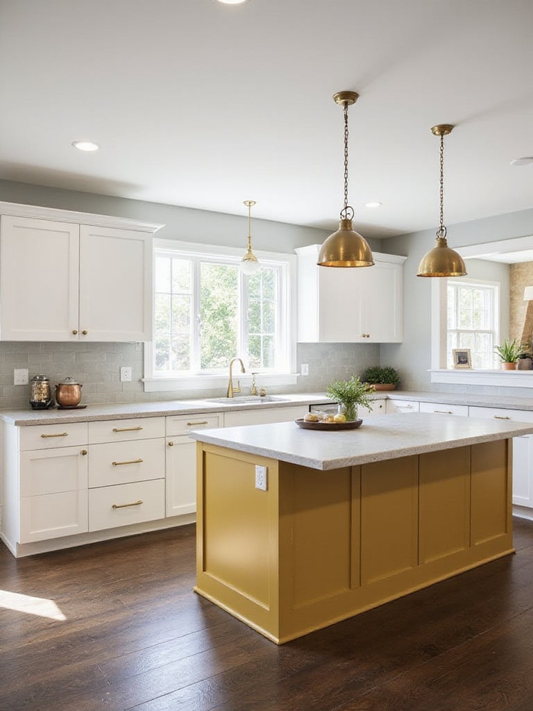
There are numerous ways to incorporate mustard yellow highlights effectively. Paint your island cabinets in rich mustard to create a central focal point. Add mustard yellow bar stools for functional seating with visual interest. Pendant lights in this warm hue can cast an inviting glow. Backsplashes offer another opportunity to introduce mustard, using tiles or creating a painted accent wall. Smaller accessories like canisters, towels, and utensils provide subtle pops throughout.
Let that sink in for a moment… rather than committing to an entire kitchen of bold color, these strategic highlights give you the energy and personality of mustard yellow in manageable doses. It’s like adding the perfect spice to a recipe—just enough to enhance without overwhelming.
For a kitchen that feels open, airy, and perpetually fresh, light blue is exceptional. It evokes calmness, serenity, and cleanliness—perfect for food preparation spaces. Visually, light blue expands space, creating an open feel that benefits smaller kitchens. This versatile color complements diverse design styles, from coastal and farmhouse to modern and minimalist.
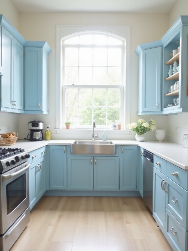
Light blue shines across design styles. In coastal kitchens, it evokes a seaside ambiance with white cabinets and nautical décor. In farmhouse settings, it adds vintage charm alongside shiplap and rustic hardware. Modern kitchens benefit from light blue’s refreshing touch when paired with stainless steel and minimalist cabinetry. Even traditional kitchens can incorporate light blue as an accent on islands or backsplashes, adding understated freshness.
“Light blue kitchens create the feeling of cooking under clear skies, bringing the serenity of perfect weather indoors regardless of what’s happening outside.”
The missing piece in many kitchen designs is this sense of airiness and breath that light blue provides. It’s not just a color choice—it’s a mood enhancer that makes your kitchen feel like a refreshing escape.
If you seek a kitchen that feels grounded and connected to nature, olive green is outstanding. This color evokes tranquility and understated sophistication, creating a calming environment. It’s versatile—both calming and energizing depending on the shade and pairings. Olive green remains timeless, ensuring your kitchen stays relevant for years. It creates a warm, inviting atmosphere perfect for meal preparation and gathering.
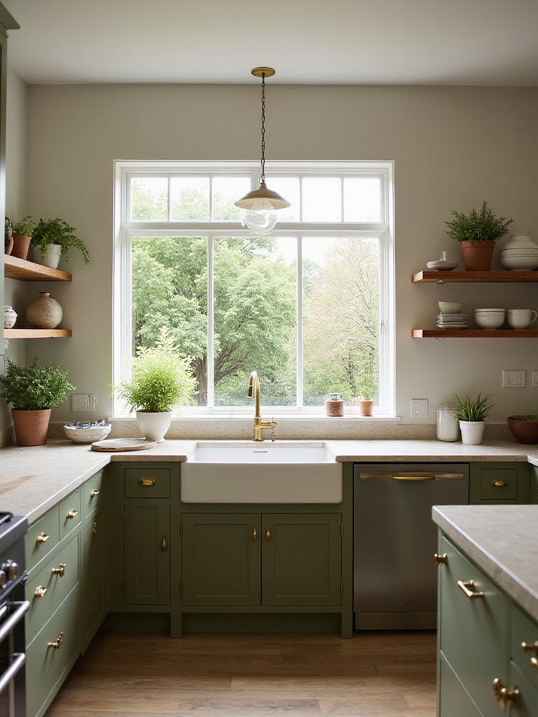
Olive green adapts beautifully across design styles. In farmhouse kitchens, it enhances rustic charm and creates natural connections. In modern spaces, it adds organic warmth when paired with sleek hardware and minimalist countertops. For traditional kitchens, olive green with classic cabinetry and warm woods creates timeless elegance. It’s perfect for Mediterranean-inspired designs, complementing their earthy aesthetic. Enhance the organic feel by pairing with natural materials like wood, stone, and woven textures.
Things took an interesting turn when I introduced olive green to a client who wanted something “different but not crazy.” The color provided exactly what they needed—distinctive character without being trendy or overwhelming. Three years later, they still love it, proving olive green’s staying power among kitchen color ideas.
To elevate your kitchen with luxury and warmth, consider copper accents. Copper offers a unique blend of warmth, sophistication, and visual interest. Its distinctive reddish-orange hue provides striking contrast against neutral tones, creating focal points and refinement. Unlike cooler metals, copper brings inviting comfort and timeless elegance. It develops a beautiful patina over time, adding character and depth.
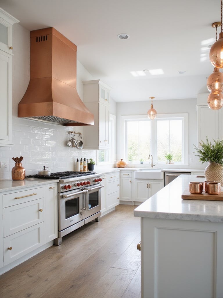
Copper accents can be incorporated in various ways. Consider copper hardware—knobs, pulls, and hinges—for subtle metallic warmth throughout cabinetry. A copper range hood creates a stunning focal point and adds grandeur. Copper pendant lights cast warm, inviting glows above islands or sinks. A copper backsplash creates a luxurious backdrop. For bolder statements, explore copper sinks or island cladding. Smaller accents like displayed cookware or countertop canisters contribute to the luxurious feel with cohesive details.
The breakthrough came when designers started mixing copper with other metals, breaking the old rule about matching all hardware finishes. This freedom allows copper to shine as a statement metal while other finishes play supporting roles. The result is a kitchen with depth, character, and a touch of unexpected luxury.
For a kitchen exuding opulence and timeless elegance, incorporate the radiant warmth of gold accents. Certain gold finishes work best in kitchens, achieving luxury without ostentation. Brushed gold, satin gold, and antique gold are generally most successful. Brushed and satin finishes offer subtle, modern elegance without flashiness. Antique gold provides vintage-inspired charm. Polished gold, while beautiful, requires more maintenance and can appear overtly glamorous. Your choice depends on your kitchen style and preferences.
Incorporating gold effectively requires moderation and thoughtful placement. Focus on hardware elements—cabinet pulls, faucets, and lighting—to introduce gold functionally and visually. Consider gold through smaller appliances to add subtle metallic warmth to countertops. Pair gold against neutral backgrounds like whites, grays, or blues to allow it to stand out appropriately. Stick to consistent gold tones throughout for cohesion. Choose high-quality materials to ensure durability and elevate perceived luxury.
You might be wondering if gold is too trendy or if it will look dated quickly. The key is in the application—when used as accents rather than major elements, gold adds timeless warmth that transcends trends. It’s the jewelry of your kitchen, adding that perfect finishing touch.
For a kitchen embodying modern sophistication, silver accents are ideal. They offer clean, contemporary aesthetics perfect for minimalist designs. Silver reflects light, making spaces feel brighter and more open—particularly beneficial in smaller kitchens. It works seamlessly with various colors and materials, from cool grays and whites to warm woods and saturated hues. The metallic finish adds subtle sophistication without being overly flashy.
Silver can be introduced through various elements. Stainless steel appliances provide significant silver tones. Brushed nickel hardware offers understated refinement compared to polished chrome. Silver light fixtures enhance modern aesthetics and add illumination. Metallic decorative items contribute to cohesive looks. For more impact, consider metallic backsplashes in stainless steel or silver-toned tile. Silver-framed mirrors reflect light and add glamour while expanding perceived space.
Here’s the inside story on silver accents: they’re not just about aesthetics—they’re incredibly practical too. Silver finishes like stainless steel are easier to clean and maintain than many other options, making them perfect for busy kitchens where both style and function matter. This practicality, combined with their timeless appeal, makes silver accents a smart choice for modern kitchen color ideas.
For a kitchen that feels inherently warm and connected to nature, earthy browns consistently deliver. These tones evoke calm, stability, and natural connection. They create a welcoming atmosphere perfect for gathering with family and friends. Brown pairs beautifully with various materials and styles, transitioning from rustic to contemporary designs. Practically speaking, brown hues forgive dirt and imperfections better than lighter colors—sensible for busy kitchens.
The spectrum of earthy browns offers vast choices for creating your desired ambiance. Chocolate brown adds depth and drama when used in moderation. Taupe, blending brown and gray, provides a modern, neutral foundation. Beige makes small kitchens feel larger, maximizing light. Terracotta creates Mediterranean or Tuscan vibes with sun-drenched warmth. Caramel adds cozy comfort and welcome. Walnut brings richness and timeless sophistication to cabinetry and accents.
Before you raise an eyebrow at brown kitchens, consider how they provide the perfect backdrop for both colorful accessories and natural elements. Unlike trendier colors that might feel dated quickly, earthy browns have staying power because they connect us to the natural world in a fundamental way.
For a kitchen promoting relaxation, soft lavender offers a uniquely calming palette. It evokes tranquility, peace, and deep relaxation. Its gentle nature is less stimulating than brighter colors, ideal for creating calm in potentially stressful cooking spaces. This subtle color surprisingly complements various styles, from farmhouse to contemporary chic.
Soft lavender pairs harmoniously with many colors. Crisp white cabinetry creates a clean, airy feel when combined with lavender walls or accents. Gray tones, particularly light grays or greige, add refined balance and modernity. Natural wood brings warmth and earthiness to lavender’s coolness, creating an inviting atmosphere. For subtle contrast, consider muted sage green or pale yellow accents. Metallic accents like brushed gold or copper introduce subtle luxury, enhancing sophistication.
The stumbling block for many homeowners is fear that lavender might feel too feminine or trendy. However, the right shade—one with gray undertones rather than pink—creates a sophisticated neutral that transcends gender associations and remains timeless. This subtle distinction makes all the difference in creating a kitchen with lasting appeal.
Looking to inject playful charm and sunny sweetness into your kitchen? Peach accents are delightful and inviting. Peach is inherently warm, universally flattering, and brings sunshine without overwhelming. It creates a cheerful, welcoming ambiance. Peach works harmoniously with kitchen colors from classic neutrals to bolder shades like teal and navy. It evokes happiness and optimism, perfect for spaces centered around cooking and gathering.
Incorporate peach through various elements. Paint an accent wall in soft peach to create a warm backdrop. Choose peach textiles—curtains, towels, or oven mitts—for easy color pops. Small appliances in peach become charming countertop accents. Peach dinnerware, vases, or artwork on open shelving add visual interest. Even small details like peach cabinet knobs make subtle yet impactful differences.
My discovery began when I realized peach isn’t just for retro 1950s kitchens—modern interpretations of this color (especially dustier, more sophisticated versions) can create spaces that feel both current and timeless. It’s like capturing permanent sunset glow in your kitchen, creating a space that feels perpetually warm and inviting.
For a kitchen exuding subtle warmth and inviting comfort, consider muted orange details. Unlike vibrant oranges, muted tones offer comforting warmth without overwhelming stimulation. They evoke happiness, energy, and appetite—ideal for culinary spaces. Terracotta or burnt sienna create sophisticated atmospheres, blending with various styles from modern to farmhouse.
Muted orange complements diverse kitchen aesthetics. In modern kitchens with sleek gray or white cabinets, it adds welcome warmth, breaking up minimalist lines. In rustic settings, it enhances cozy farmhouse feels alongside natural woods. For bohemian kitchens, it blends with earthy tones and natural textures, contributing to eclectic aesthetics. Even mid-century modern kitchens, where orange was defining, find a natural partner in muted orange tones.
The potential here is enormous. Muted orange brings warmth without the commitment or boldness of brighter hues. It’s the perfect “starter color” for those wanting to move beyond neutrals but aren’t ready for dramatic statements. This approachable quality makes it one of the most versatile kitchen color ideas for homeowners at any stage of their design journey.
As we’ve explored these 24 diverse kitchen color ideas, it’s clear that color is a powerful tool in transforming your cooking space. From timeless whites to bold jewel tones, each palette brings its own mood and style to the heart of your home.
The perfect kitchen color is ultimately a personal choice, reflecting your taste and lifestyle. Don’t be afraid to experiment with different shades and find what resonates with you. Whether you opt for a complete color overhaul or subtle accents, the right choices can revitalize your kitchen, making it more enjoyable, inspiring, and beautiful.
Take these ideas, ignite your imagination, and embark on the exciting journey of transforming your kitchen with color. Your dream kitchen—the one that makes you smile every time you enter it—is just a color choice away!