Physical Address
304 North Cardinal St.
Dorchester Center, MA 02124
Physical Address
304 North Cardinal St.
Dorchester Center, MA 02124
Create a serene bedroom that sounds as good as it looks. Discover 18 secrets for choosing wall colors that enhance rest, creativity, and acoustic perception.
You know the question I get all the time? It’s not just about soundproofing. It’s about the vibe. A musician will spend thousands on a guitar, on monitors, on plugins… and then practice or mix in a room painted a soul-crushing beige that was chosen by the landlord a decade ago. They’ll ask me, “Why do I feel so uninspired in here? Why does my focus drift?”
They think the answer is more gear or a better chair. It’s not. The problem is, they’ve ignored the largest instrument in the room: the room itself. Color isn’t just decoration. It’s an environmental EQ. It sculpts light, directs focus, and shapes your emotional state before you even play a single note. It can make a room feel expansive and open, like a cathedral reverb, or tight and focused, like a dry vocal booth. Getting it right is the difference between a space that fights you and one that becomes a seamless extension of your creative process.
So let’s cut the corporate paint-chip talk. Here’s the real story on how to choose colors for the most important room in your house—the place you rest and the place you create.
Before you even think about cracking open a can of paint, we need to talk strategy. This is like pre-production for an album. You don’t just hit record. You plan. You figure out the key, the tempo, the emotional arc. This is that, but for your walls.
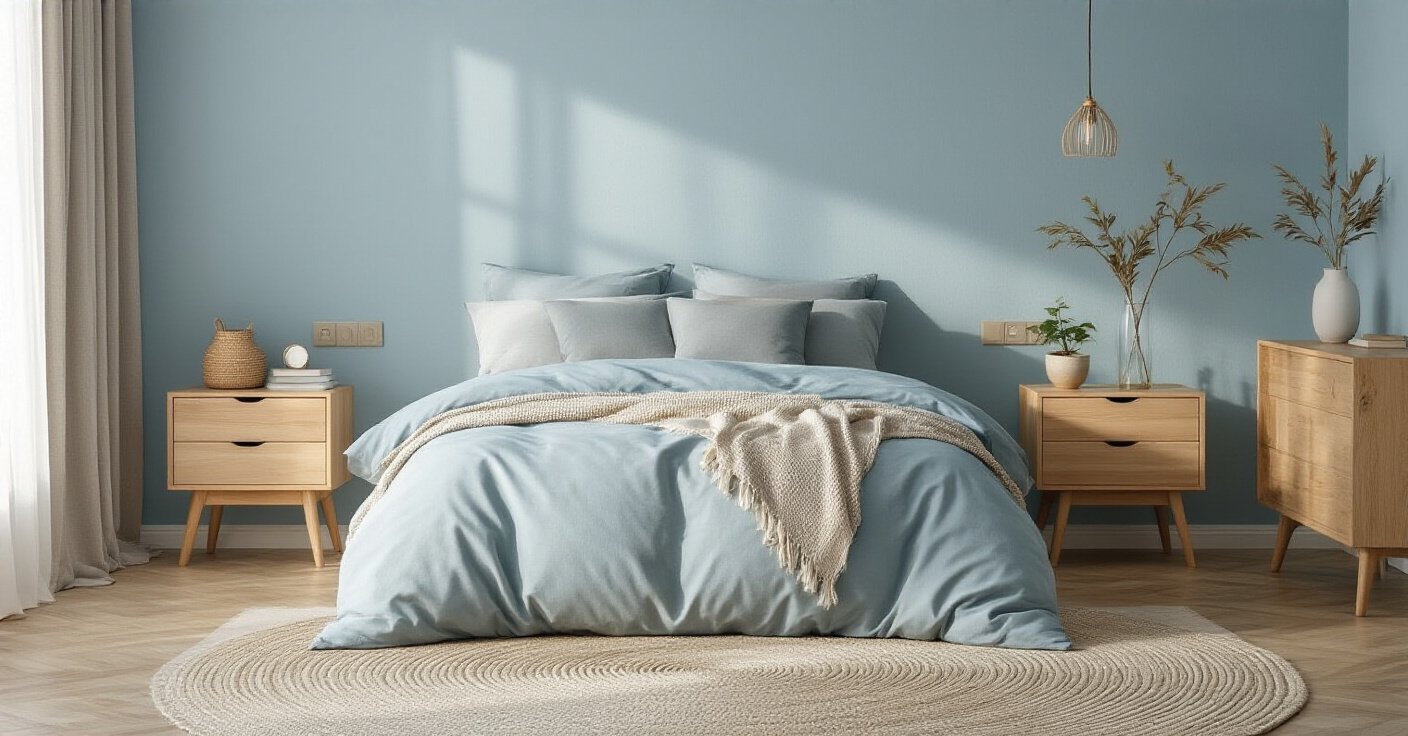
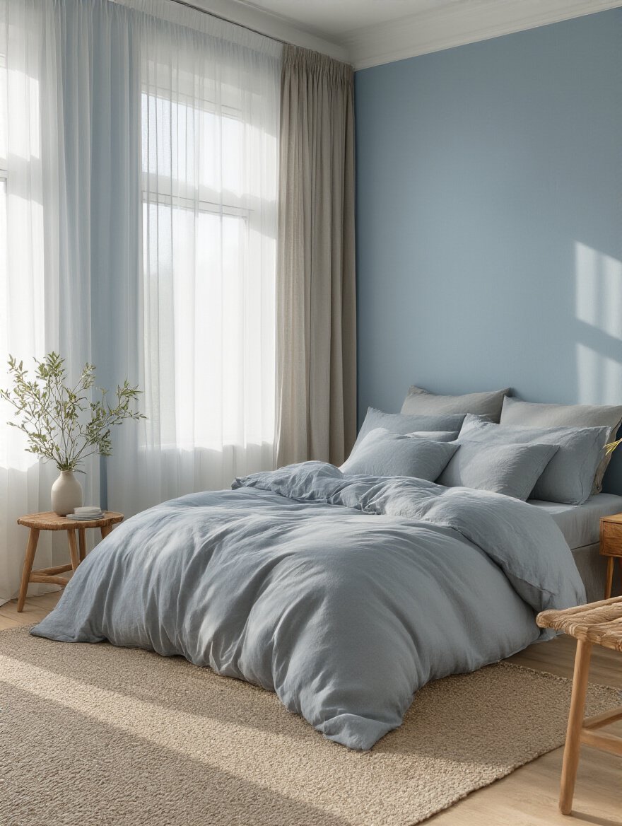
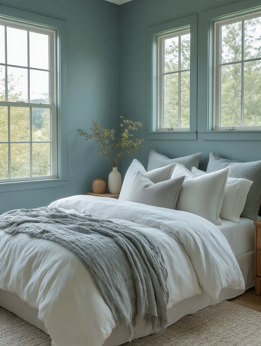
Forget the generic advice about “blue is calming.” Yes, it can be. But why? It’s about cognitive load. Your brain is constantly processing information—visual, auditory, everything. Bright, chaotic, or jarring colors are the visual equivalent of a loud, atonal mess. They create static. Cool, muted tones—the soft blues, deep greens, resonant grays—reduce that visual noise. This frees up mental bandwidth, allowing you to either relax into sleep or sink deeper into the music you’re creating or listening to.
I once worked with a phenomenal jazz pianist who had his practice room painted a screaming primary yellow. He said he wanted “energy,” but he couldn’t focus for more than 20 minutes. The color was literally yelling at him. We repainted it in a deep, muted teal. It wasn’t about making it “sleepy”; it was about removing the distraction. Suddenly, the only thing demanding his attention was the music. His focus doubled, and he said the chords felt richer because his mind wasn’t fighting the walls.
Ready to find your own focus? Think less about “what color?” and more about “what feeling?” Are you trying to quiet your mind for sleep, or focus it for intricate work?
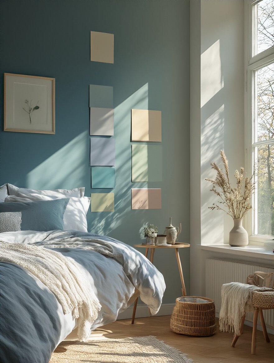
Everyone talks about LRV, or Light Reflectance Value. It’s a number from 0 to 100 that says how much light a color bounces back. High LRV (whites, pastels) makes a room feel brighter. Low LRV (darks, jewel tones) absorbs light. That’s the simple science. But the art is in how you use it. You’re not just painting a room; you’re sculpting the light that will define your mood and creative energy every day.
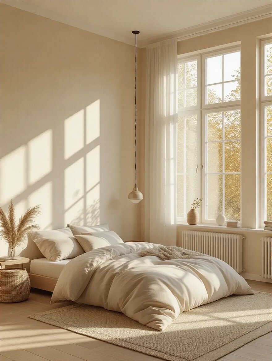
The BS everyone repeats is that dark rooms must be painted white. Not always. A north-facing room gets cool, indirect light. Painting it stark white can make it feel like a sterile lab—absolutely dead for creative warmth. In that case, an off-white with a creamy or warm greige undertone (a higher LRV, but with warmth) can make the cool light feel intentional and soft, not depressing. You have to work with the light, not against it. As a musician, think of light as your room’s natural reverb—you want to tune it, not just blast it.
Before you go all-in on that “Chantilly Lace,” you need to know how it plays with your room’s built-in sound system—the furniture.
This is about creating harmony, literally. A room where the walls are fighting the furniture, rug, and art is visually dissonant. It’s like a band where the bass player is in a different key from the guitarist. That constant, low-level visual clash creates a subconscious tension that can absolutely sabotage a relaxing atmosphere or a creative flow state. It’s visual noise that distracts the ear.
I learned this the hard way in my own first home studio. I had a beautiful warm, cherry-wood desk and a cool, gray-blue rug I loved. I painted the walls a crisp, cool gray, thinking it was “modern.” The result was a mess. The warm desk looked orange against the gray, and the whole room felt disjointed and cheap. I was trying to mix warm and cool tones without a bridge. The shortcut? Find a color that shares an undertone with your most expensive or beloved items. I repainted with a greige—a gray with a warm, beige undertone—and suddenly the desk and the rug started talking to each other. The room felt cohesive, calm, and professional.
Once you’ve got your instruments playing in the same key, it’s time to make sure the song is actually yours.
Here’s my pet peeve: people choosing colors based on what’s trending on Pinterest. That’s like a folk singer trying to write a metal song because it’s popular. Your bedroom, especially if it doubles as your music space, has to be an authentic reflection of you. It’s your sanctuary, your incubator. The psychological comfort of being in a space that feels like your own is immeasurable. It’s the difference between wearing a perfectly tailored suit and a rental tux.
When a space genuinely tells your story, it creates a sense of safety and belonging that fosters deep rest and uninhibited creativity. You stop “performing” and start “being.” Think about the albums that define you. The artists you admire. What’s the color of that feeling? Is it the raw, textured black of a Johnny Cash record? The dreamy, hazy pastels of a Bon Iver album? That’s your starting point.
Nate Berkus said it best: “Your home should tell the story of who you are.” For musicians, I’d add: it should be the room where that story feels most natural to tell.
So, forget the trends. What color is the soundtrack of your life? That’s the color for your walls.
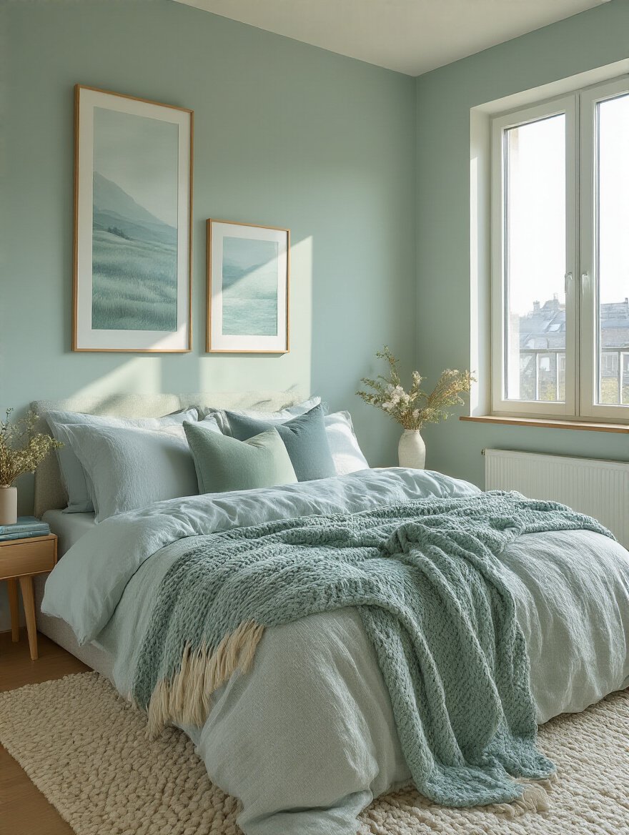
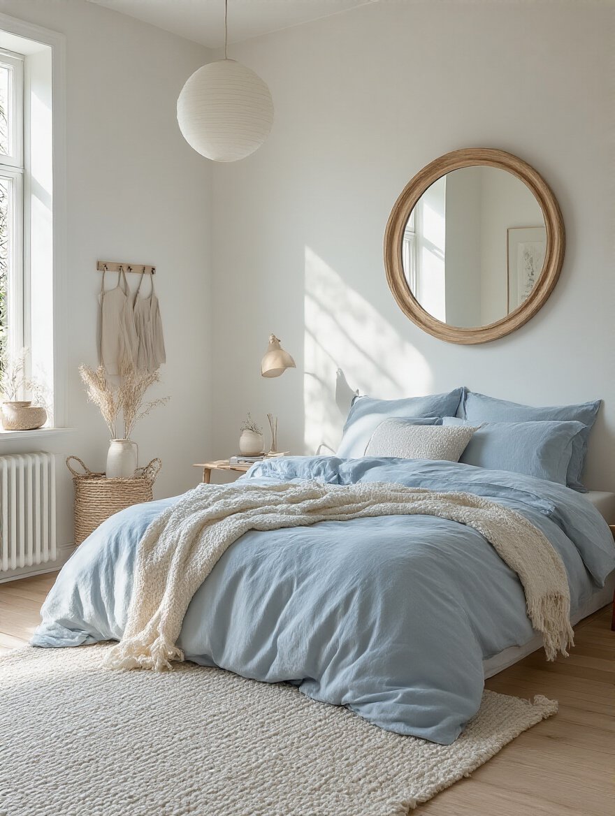
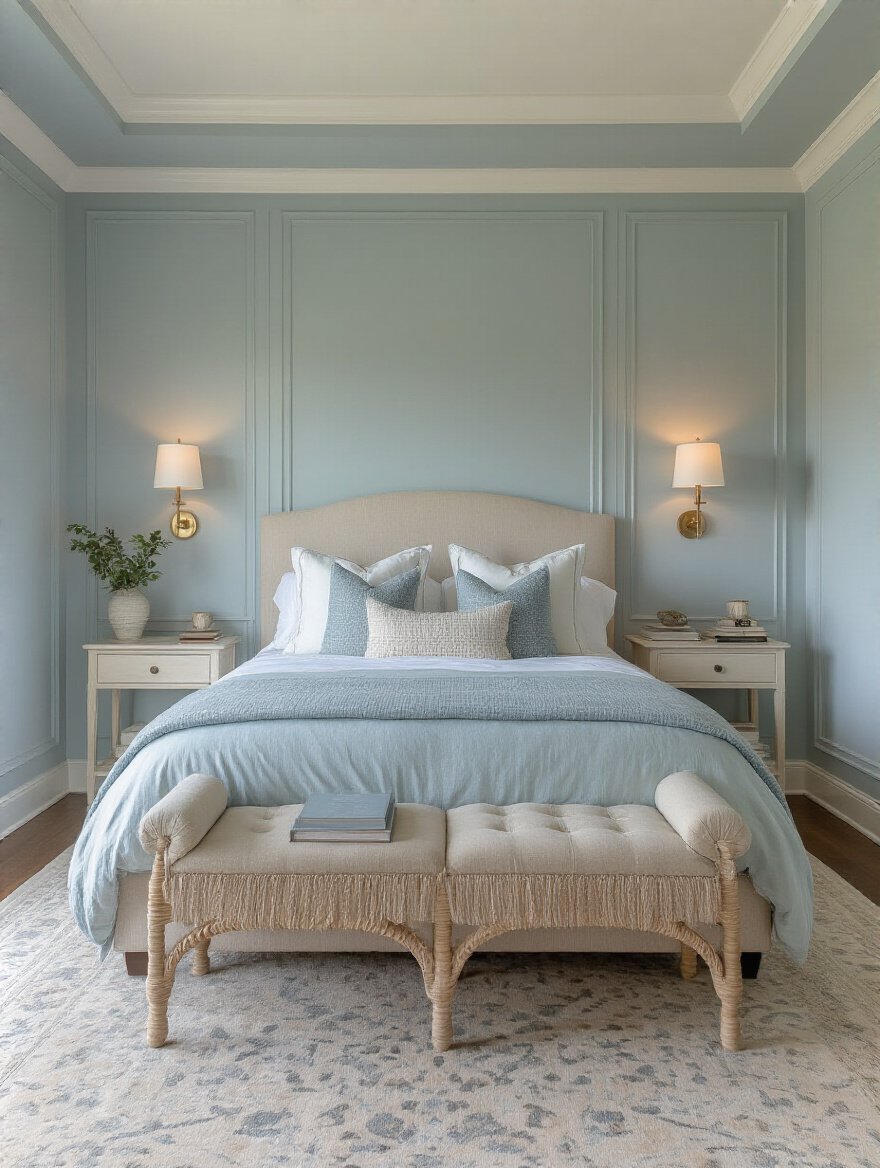
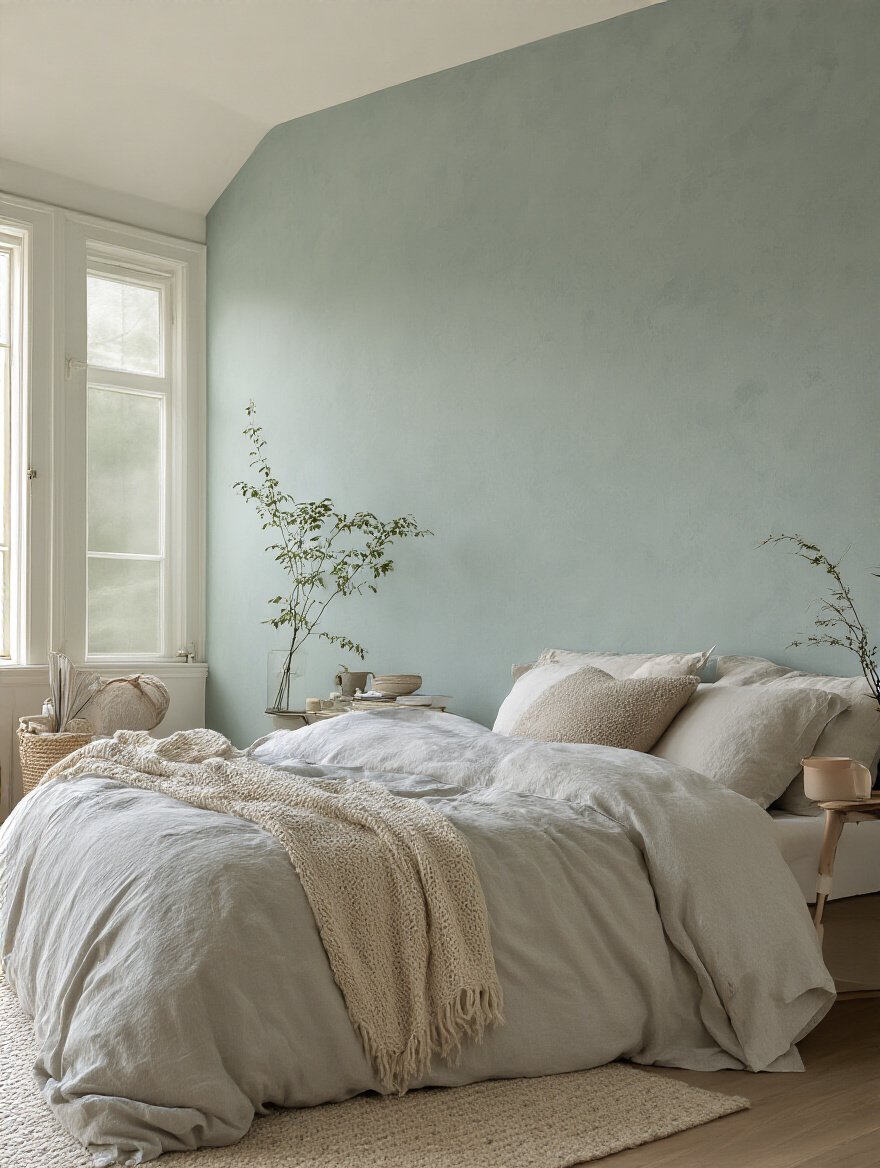
Okay, let’s get specific. If the goal is pure, unadulterated rest—the kind of sleep that recharges you for a long day of touring, teaching, or tracking—some colors are just biologically better. These are hues that signal “safety” to our primal brains. They echo the natural world: the muted greens of a forest floor, the deep blues of a twilight sky, the soft grays of a misty morning.
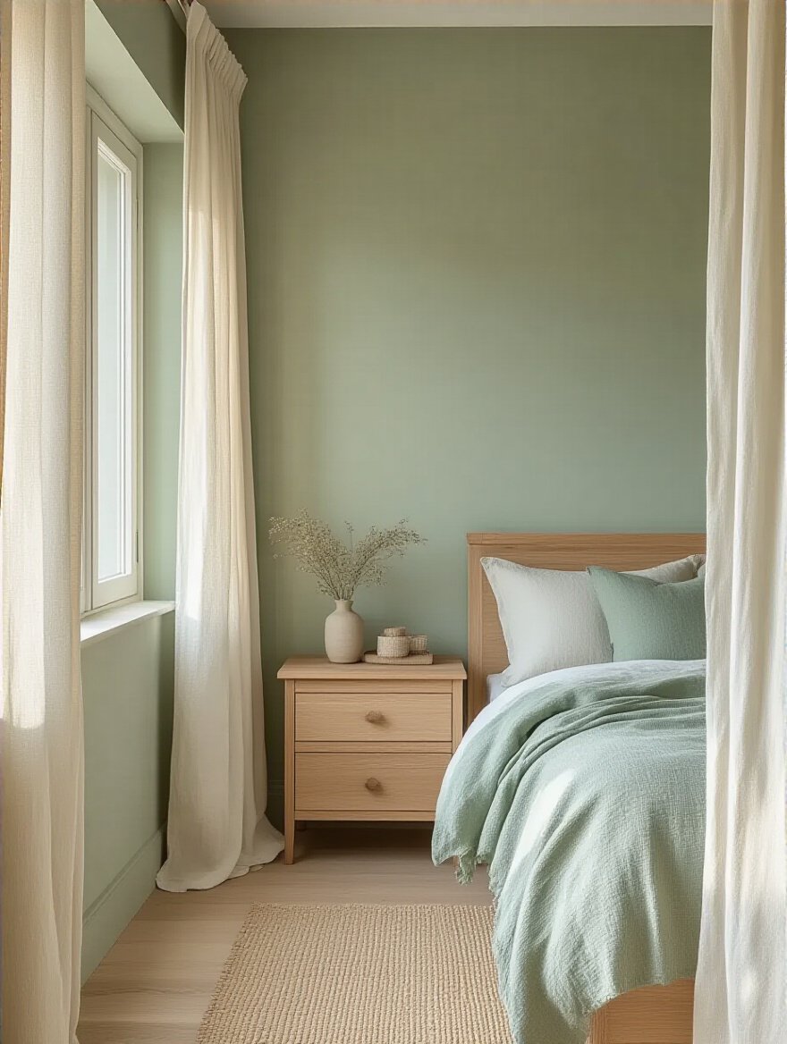
But don’t just grab any blue. A vibrant, electric blue is stimulating. You want blues with a hint of gray or green. For greens, think sage, olive, or moss—colors with an earthy, grounded quality. The shortcut here is to look for colors described as “muted,” “dusty,” “smoky,” or “desaturated.” These are colors with the volume turned down. They have complexity and depth that feels resonant and rich, not flat and boring. These are the tones that lower your heart rate and quiet the mental chatter.
Now that we’ve got the theory down, let’s get into the nitty-gritty of making it work in your space.
This is where the engineering brain and the artist brain have to work together. A great color in the wrong context is a wasted opportunity. You have to consider the room’s architecture, its size, and how you want it to feel when you’re in it.
You’ve got a small bedroom that you’re also trying to cram a desk, a guitar, and an amp into. It feels tight. Acoustically, small rooms can be boxy and reflective. The classic advice is to paint it a light color to make it feel bigger. This works, but it’s not just about slapping on some white paint. The real magic is in creating an uninterrupted visual field.
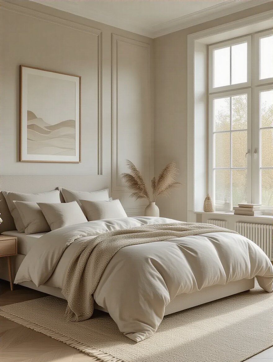
This means painting the walls, the trim, and even the ceiling in the same light color, or very similar shades of it. Doing this erases the hard lines and corners that your brain uses to perceive the room’s boundaries. It blurs the edges, making the space feel more open and less claustrophobic. An eggshell or satin finish will bounce a little more light around than a flat matte, further enhancing the effect without creating harsh glare. It’s the visual equivalent of adding a smooth, subtle reverb to make a small sonic space feel larger and more atmospheric.
But what if you don’t want a big, airy sound? What if you want intimacy?
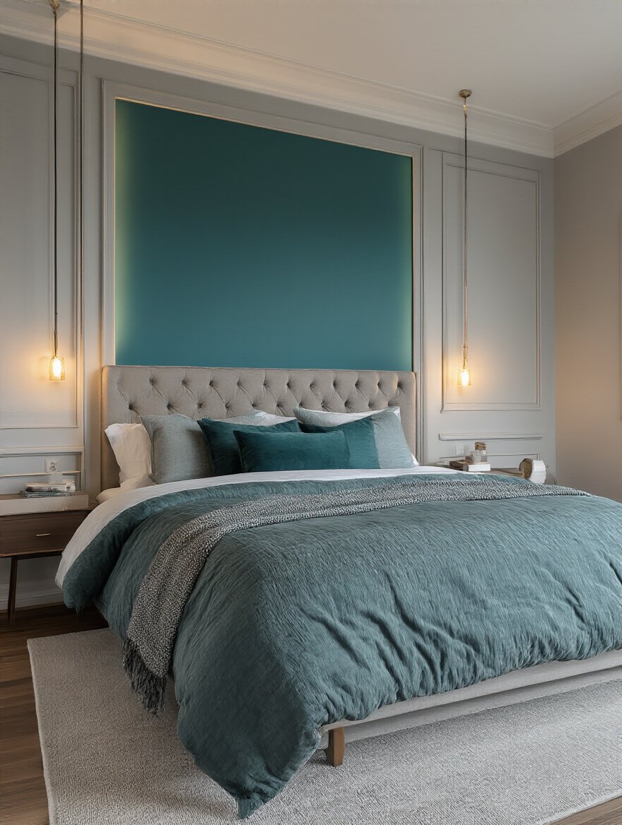
This is for my audiophiles and late-night songwriters. Sometimes you don’t want a room to feel bigger. You want it to feel like a cocoon. A deep, saturated color—think charcoal gray, navy blue, forest green—on all four walls can do just that. It’s a bold move, but it works by absorbing light and visually pulling the walls in around you, creating a cozy, womb-like effect that’s perfect for immersive listening or focused creation.
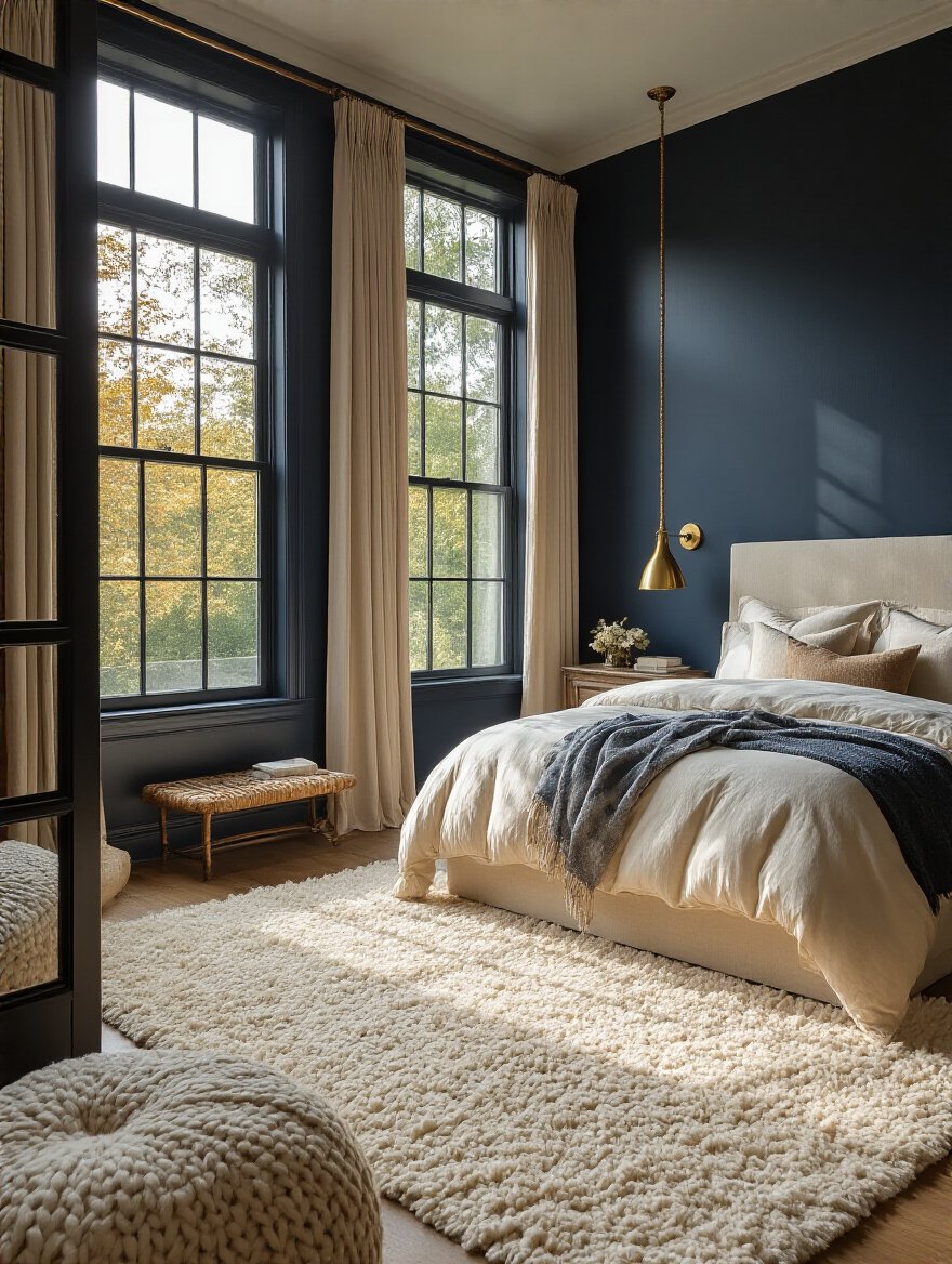
I designed a listening room for a client who had a massive, open-plan living space. It felt cavernous and impersonal. We painted the designated listening area a deep, velvety charcoal. We even painted the ceiling. The result? When you stepped into that zone, the rest of the world fell away. The dark color minimized visual distractions, forcing his attention directly onto the soundstage created by his speakers. He said it was like putting on a pair of high-end headphones for the entire room. This is how you create a space that begs you to sit down, shut up, and just listen.
Once the walls are handled, you have to deal with the details that frame them.
Think of your ceiling and trim as the framing for your art. Bad framing can ruin a masterpiece. Most people just default to stark white for both, but this can create harsh, distracting lines that chop up the visual flow of a room. It’s like putting a hard, abrupt gate on a beautiful, decaying reverb tail. It just feels wrong.
The pro move for a seamless, immersive feel is to paint the trim the exact same color as the walls, but in a different sheen. For example, use an eggshell finish on the walls and a semi-gloss on the trim. This creates a subtle, textural difference that looks incredibly sophisticated and custom, without introducing a new, competing color. For the ceiling, a simple trick is to take your wall color and have the paint store mix it at 50% strength. This creates a color that is harmonically related to the walls but just light enough to give a sense of lift. It makes the whole room feel like one cohesive, intentionally designed space.
Now, let’s put it all together in a balanced mix.
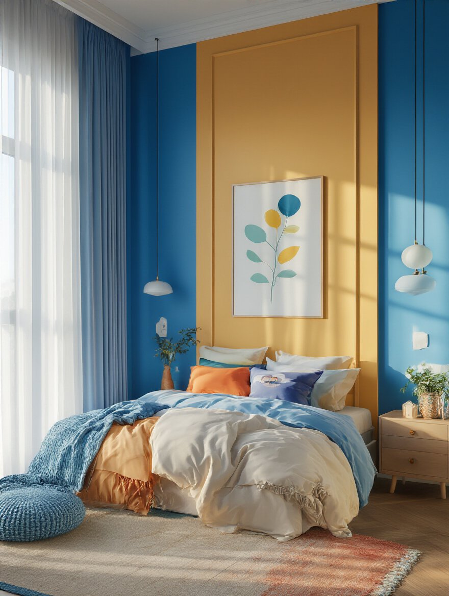
The 60-30-10 rule sounds like jargon, but it’s just a simple recipe for a balanced room. Think of it like mixing a song:
I once walked into a client’s studio that was all gray—gray walls, gray desk, gray rug. It was tonally balanced but incredibly boring. There was no lead instrument! We kept the gray walls (60%), brought in a warm leather chair and wood accents (30%), and added a few pops of a vibrant orange in the artwork (10%). The room instantly came to life. It had rhythm, harmony, and a melody. It felt complete.
Once you’ve got the fundamentals, you can start breaking the rules—or at least, applying them with more creative flair. This is where you can really make a space your own.
An accent wall is not just an excuse to use a bold color you’re scared to put everywhere. It has a job to do. In a music room or bedroom studio, its job is to create a stage. The ideal accent wall is the one behind your primary activity area—behind your headboard in a bedroom, or behind your mixing desk or main instrument in a studio. It draws the eye and anchors the room’s purpose.
A shortcut I love for musicians is to make the accent wall functional. Don’t just paint it. Cover that wall in acoustically transparent fabric in a deep, rich color and hide your bass traps or absorption panels behind it. Now your accent wall isn’t just a pretty face; it’s a critical part of your room’s acoustic treatment. You get a powerful visual statement and a better-sounding room. It’s the ultimate two-for-one.
And from that focal point, you can extend the feeling throughout your entire home.
You know that feeling when you walk through a house and every room is a completely different, clashing color? It’s jarring. It’s like listening to a playlist that jumps from a delicate folk song to a death metal track to a commercial jingle. Creating color continuity is about giving your home a cohesive “album” feel, rather than a chaotic “random shuffle” feel.
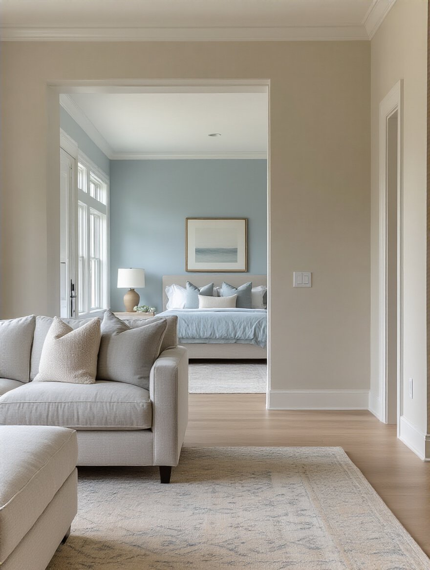
The trick isn’t to paint every room the same color. It’s to use a consistent palette. Pick 3-5 colors that work well together and use them in different proportions in each room. Maybe the living room is a light greige with deep blue and warm wood accents. The adjoining bedroom could then have deep blue walls, with that same greige on the bedding and the same wood tones in the furniture. You’re using the same “instruments,” just changing the arrangement. This makes a home feel larger, more intentional, and infinitely more peaceful.
The temperature of those colors is another powerful tool in your mixing desk.
Color temperature is the emotional core of your palette. Cool colors (blues, greens, cool grays) are recessive. They feel calm, spacious, and analytical. They create a bit of distance, which can be perfect for tasks that require precision and a clear head, like mixing audio or editing. They are the sound of a clean, digital reverb—pristine and controlled.
Warm colors (reds, oranges, yellows, warm tans) are aggressive. They advance toward you. They feel intimate, cozy, and energetic. They can be amazing for a songwriting room where you want to foster a vibe of connection and emotional expression. They are the sound of a warm, saturated tape machine or a vintage tube amp—full of character and life. A great home studio might even have both: a cool-toned, focused mixing area and a warm-toned, cozy tracking corner.
Once you have that perfect sound, you need to protect it.
This is pure practicality. Your bedroom and studio are high-traffic areas. Mic stands get bumped into walls. Guitar cases leave scuffs. Late-night coffee gets spilled. Using cheap, flat paint is a recipe for a room that looks old and tired in six months. The frustration of seeing your perfect vibe ruined by scuff marks is a real inspiration-killer.
Invest in a paint with an eggshell or satin finish. The slight sheen makes them vastly more durable and easier to clean than a flat or matte finish. Most scuffs and marks can be wiped away with a damp cloth without leaving a shiny spot. This isn’t just about being neat; it’s about preserving the integrity of the environment you’ve so carefully created. A pristine, well-maintained space feels more professional and respectful of the work you do in it.
Want to add another layer of complexity? Let’s talk texture.
When you think of “pattern,” you might think of loud, busy wallpaper. Forget that. I’m talking about subtle, textural patterns that add depth and sophistication, much like a ghost note in a drum pattern or a subtle delay on a vocal. It’s something you feel as much as you see.
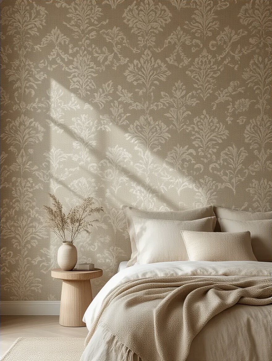
A fantastic way to achieve this is with a tone-on-tone pattern. You can use a stencil with the exact same paint color as your wall, but in a higher sheen (a gloss pattern over a matte wall, for example). The pattern only becomes visible as the light hits it from different angles. It adds a layer of quiet luxury and intrigue without being distracting. For a music space, this is perfect. It adds visual richness without creating noise, keeping the focus right where it belongs: on the sound.
You’ve done the research, you have a plan. Now it’s about execution. These final tips are the difference between a good result and a great one. This is the mastering phase.
I’ll confess: I once thought I could skip this step. I was painting a client’s vocal booth and we chose a lovely, neutral gray from a tiny paint chip. We put it on the walls. Under the focused, warm light of the booth’s single lamp, that “neutral” gray turned a sickly, drab lavender. The singer hated it. It felt cold and clinical. We lost a day and hundreds of dollars repainting it.
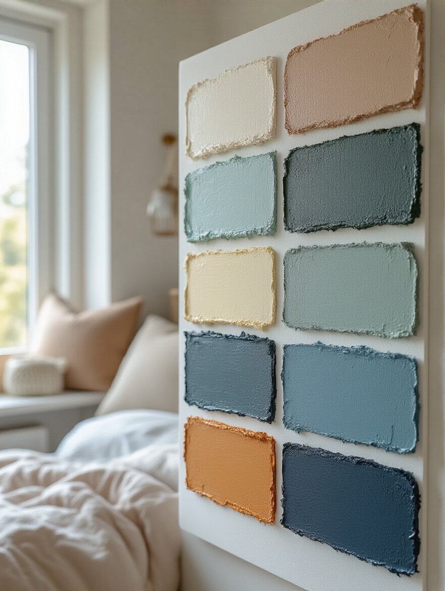
Never, ever trust a paint chip. Buy a sample pot. Paint a large (at least 2’x2′) square on two different walls. Better yet, paint a large piece of foam core board and move it around the room. Look at it in the morning light, at noon, and at night under the exact artificial light you will use in that room. Light is everything. It will fundamentally change how a color feels. Skipping this step is the single most expensive mistake you can make.
Don’t just test it—live with it for a few days.
Rushing your color choice is like rushing a recording take. You might get it done, but you’ll almost certainly regret it and have to do it over. Your perception of a color changes over time. You need to give yourself a few days to sit with the samples on the wall. Does it still feel right on day three? Does it welcome you into the room? Or are you already starting to notice things you don’t like?
Color is an emotional decision as much as an aesthetic one. Let your emotional response settle. If you feel any doubt, listen to it. The initial excitement of a new color can blind you to its flaws. Patience is your best tool for getting a result that you will love for years, not just for a week.
Once you love it, take care of it.
Your perfectly tuned room won’t stay that way on its own. Dust and grime accumulate on walls, dulling the color. Direct sunlight will bleach the pigments, especially in deeper, saturated hues. Think of this as regular instrument maintenance, like changing guitar strings or cleaning dust off a mixing console.
Use UV-blocking blinds or curtains on windows that get harsh, direct sun. This is non-negotiable for preserving rich colors. Once a month, run a soft microfiber cloth or the brush attachment of your vacuum over the walls to remove dust. This simple step will keep your colors looking fresh and true for years and has the added benefit of improving your room’s air quality.
But sometimes, the project is just too big for one person to handle.
Look, you could probably learn to master your own album. But a professional mastering engineer will get a better result because they have trained ears, specialized gear, and years of experience. The same is true for color. A professional designer or color consultant has a trained eye. They see Undertones and light interactions that you will miss.
When should you call one? If you’re struggling with a truly awkward space (weird angles, terrible light), if you’re trying to create a cohesive palette across an entire house, or if you’re simply paralyzed by choice. The cost of a consultation is almost always less than the cost (and agony) of choosing the wrong color and having to repaint. It’s not an admission of defeat; it’s a smart investment in getting the project done right, the first time.
You’ve made it. You now understand that your walls aren’t just passive surfaces. They are active participants in your life. They can be tuned like an instrument to foster rest, enhance focus, and inspire creativity. By thinking about color not as just paint, but as a tool for shaping light, emotion, and even your perception of sound, you’re no longer just decorating. You’re designing your life.
Remember the key takeaways: Reduce visual noise. Work with your light. Create harmony between your walls and your belongings. Choose colors that are an authentic reflection of you. Don’t be afraid to go bold and create a cozy, immersive cocoon if that’s what your soul needs. Test everything.
Your bedroom is your sanctuary, your studio, your retreat. It’s the most important space in your world. Now go and paint it into a place that not only looks beautiful, but feels like home and sounds like a perfectly mixed record.